How to Choose a White Paint Color
To the uninitiated, white paint seems like it should be the easiest color to choose.
After all, it's just white right?
Yet designers, homeowners, and furniture painters often discover that selecting the right white can be surprisingly difficult. A white that looks beautiful in one room can appear cold in another. A shade that feels crisp on a paint chip can suddenly turn yellow, gray, or even slightly pink once it's applied.
The reason is simple:
White is never just white. It is notoriously tricky to nail the exact shade of white you are going for.
Every white paint contains subtle undertones that influence how it appears in different environments. Lighting, surrounding materials, and neighboring colors all affect the way a white is perceived.
Understanding these factors can make choosing the right white dramatically easier.
Every white carries an undertone, and that undertone shifts with light, materials, and its surroundings.
Why White Paint Is So Difficult
Most colors announce themselves immediately.
You know when you're looking at blue, green, black, or brown.
White is different.
Its character is often hidden beneath the surface.
The undertones in a white paint may be so subtle that they are nearly invisible on a sample card. Once the paint covers a larger surface, however, those undertones become much more noticeable.
This is why two whites that appear almost identical on a paint swatch can look completely different on a wall, cabinet, or piece of furniture.
The secret to choosing the right white is learning to identify those hidden undertones before committing to a color.
Understanding White Paint Undertones
Every white paint falls somewhere on a spectrum between warm and cool.
Warm Whites
Warm whites contain subtle hints of:
Cream
Beige
Yellow
Greige
Soft taupe
These whites tend to feel welcoming, comfortable, and timeless.
Warm whites pair beautifully with:
Natural wood
Antique furniture
Brass finishes
Traditional interiors
Cottage and farmhouse styles
Historic homes
Because warm whites soften a space, they often create a cozy atmosphere that feels collected and lived-in.
Cool Whites
Cool whites contain traces of:
Gray
Blue
Green
Violet
These whites generally feel cleaner and more architectural.
Cool whites work especially well with:
Contemporary interiors
Modern design
Stainless steel
Marble
Black accents
High-contrast color schemes
Cool whites can feel fresh and sophisticated, but in some situations they may appear stark if the space lacks warmth elsewhere.

Warm whites feel soft and collected, while cool whites create a cleaner, more architectural appearance.
The Importance of Natural Light
Lighting may be the single most important factor when choosing a white paint.
The same white can appear dramatically different from one room to another.
North-Facing Rooms
North-facing spaces receive cooler light throughout the day.
In these rooms, cool whites often appear even cooler.
Warm whites usually help balance the space by adding softness and warmth.
South-Facing Rooms
South-facing rooms receive abundant warm sunlight.
These spaces are generally the most forgiving.
Both warm and cool whites tend to perform well because the natural light enhances the color.
East-Facing Rooms
East-facing rooms receive bright morning light and cooler afternoon light.
Whites may appear warmer early in the day and cooler later on.
West-Facing Rooms
West-facing rooms receive warm golden light in the afternoon and evening.
Warm undertones often become more pronounced as the day progresses.

The same white can appear cooler, warmer, brighter, or more muted depending on the direction and time of natural light.
Consider Your Fixed Elements
One of the most common mistakes people make is choosing white paint without considering the existing materials in the space.
Before selecting a white, examine:
Flooring
Countertops
Tile
Stone
Cabinetry
Upholstery
Wood tones
These elements already contain undertones.
If your flooring leans warm and your white leans cool, the contrast may feel uncomfortable. Likewise, a creamy white placed beside a cool gray countertop may suddenly look yellow.
White paint should work with the materials that are staying.
Not against them.
Why Sample Cards Can Be Misleading
Paint chips are helpful, but they have limitations.
A two-inch sample does not reveal how a color behaves across an entire wall or piece of furniture.
White paint is particularly sensitive to scale.
The larger the painted surface becomes, the more visible the undertones become.
For this reason, we always recommend testing your white paint in the actual environment where it will be used.
Observe it:
Morning
Midday
Evening
Artificial lighting
A color that looks perfect at noon may feel completely different after sunset.

Paint a large sample, move it around the room, observe it throughout the day, and allow time before making your final decision.
Choosing White for Furniture
Furniture presents a unique challenge because it can move between rooms and lighting conditions.
When selecting a white furniture paint, think beyond the room where you're painting it today.
Ask yourself:
Will this piece eventually move?
Does it sit beside warm woods?
Does it need to coordinate with multiple spaces?
In many cases, softer whites provide greater versatility because they adapt more easily to changing environments.
Extremely bright whites can sometimes feel harsh on furniture, particularly on vintage or traditional pieces.
The Difference Between Crisp White and Soft White
Many people enter the selection process believing they want the purest white available.
Sometimes they do.
But often what they actually want is contrast.
A bright white can create dramatic contrast against dark colors, black accents, or richly saturated hues.
A soft white creates a gentler transition that feels more relaxed and layered.
Neither approach is wrong.
The question is simply what atmosphere you want to create.
Choose a Crisp White If You Want:
Clean contrast
Modern styling
Bright spaces
Gallery-like simplicity
Strong black-and-white combinations
Choose a Soft White If You Want:
Warmth
Historic character
A collected appearance
Cozy interiors
Natural transitions between colors
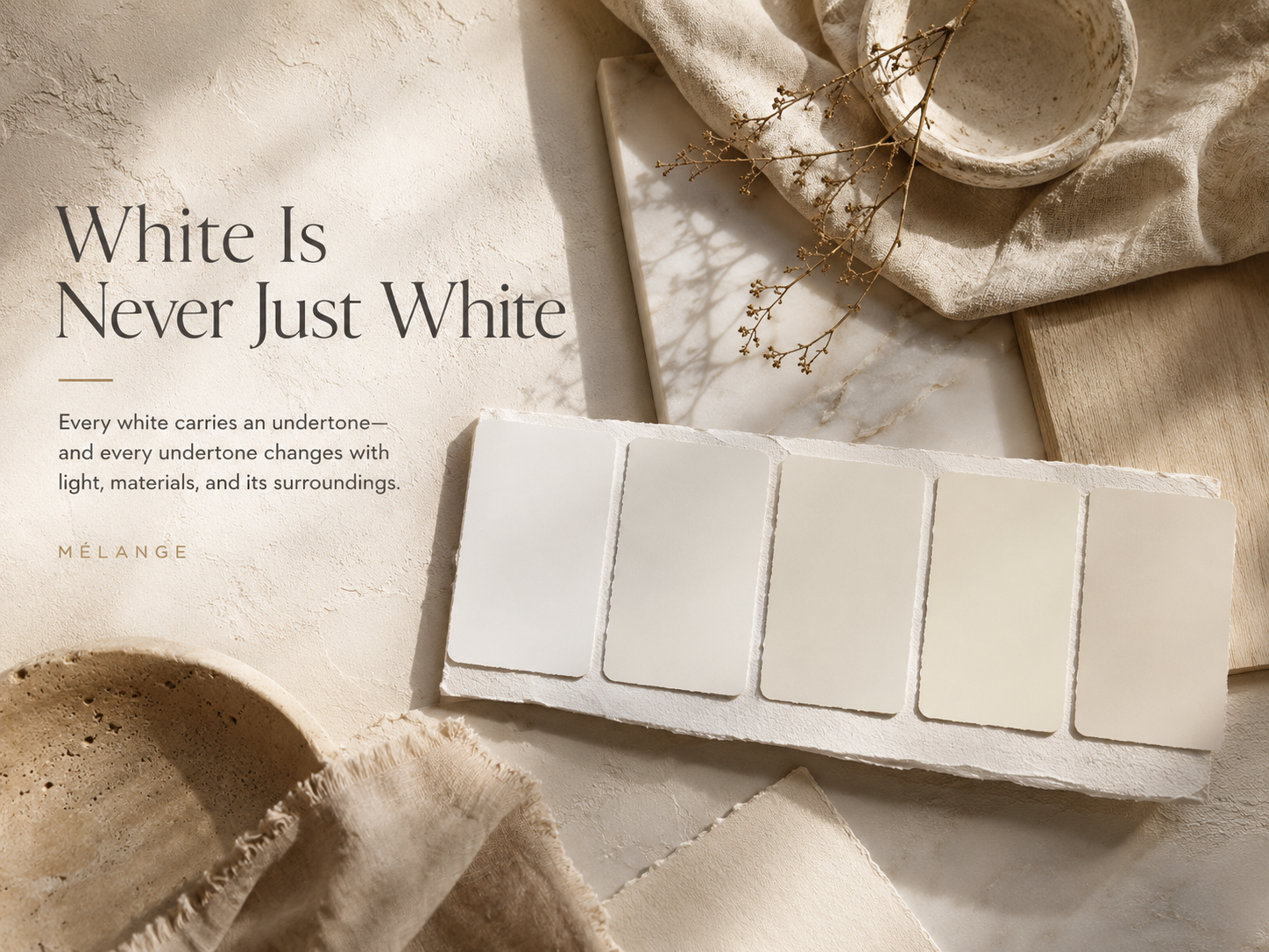
Choosing a White from the Mélange Metamorphosis Collection
Our collection includes several whites and light neutrals designed to serve different purposes.
Paperwhite
Paperwhite is our cleanest and most straightforward white.
It provides a fresh backdrop and works beautifully for trim, cabinetry, furniture, and modern interiors.
Lunaria
Lunaria introduces softness while remaining bright and versatile.
It feels luminous rather than stark.
Lunaria
Gossamer offers subtle greige warmth and pairs beautifully with natural materials, antiques, and layered interiors.
Vellum
Vellum provides the warmth of a soft cream while maintaining sophistication and restraint.
It is ideal for creating inviting, comfortable spaces.
Mothwing
Mothwing sits at the intersection of white, gray, and greige.
Its complexity makes it one of the most adaptable colors in the collection.

Compare Paperwhite, Bone, Lunaria, Vellum, and Mothwing to find the white or light neutral that best suits your space.
The Most Important Question
Before choosing a white paint, ask yourself:
How do I want the space to feel?
Not what color do I want.
What feeling do I want.
Bright and modern?
Soft and welcoming?
Collected and historic?
Clean and architectural?
The answer to that question often reveals the right white more quickly than any paint swatch ever will.
Final Thoughts
White paint is one of the most powerful design tools available.
It influences every color around it.
It shapes how light behaves within a room.
It establishes atmosphere before a single piece of furniture is placed.
The best white is not necessarily the brightest white.
Nor is it the warmest.
The best white is the one that feels completely at home in the story your space is trying to tell.
When you find that white, everything else becomes easier.