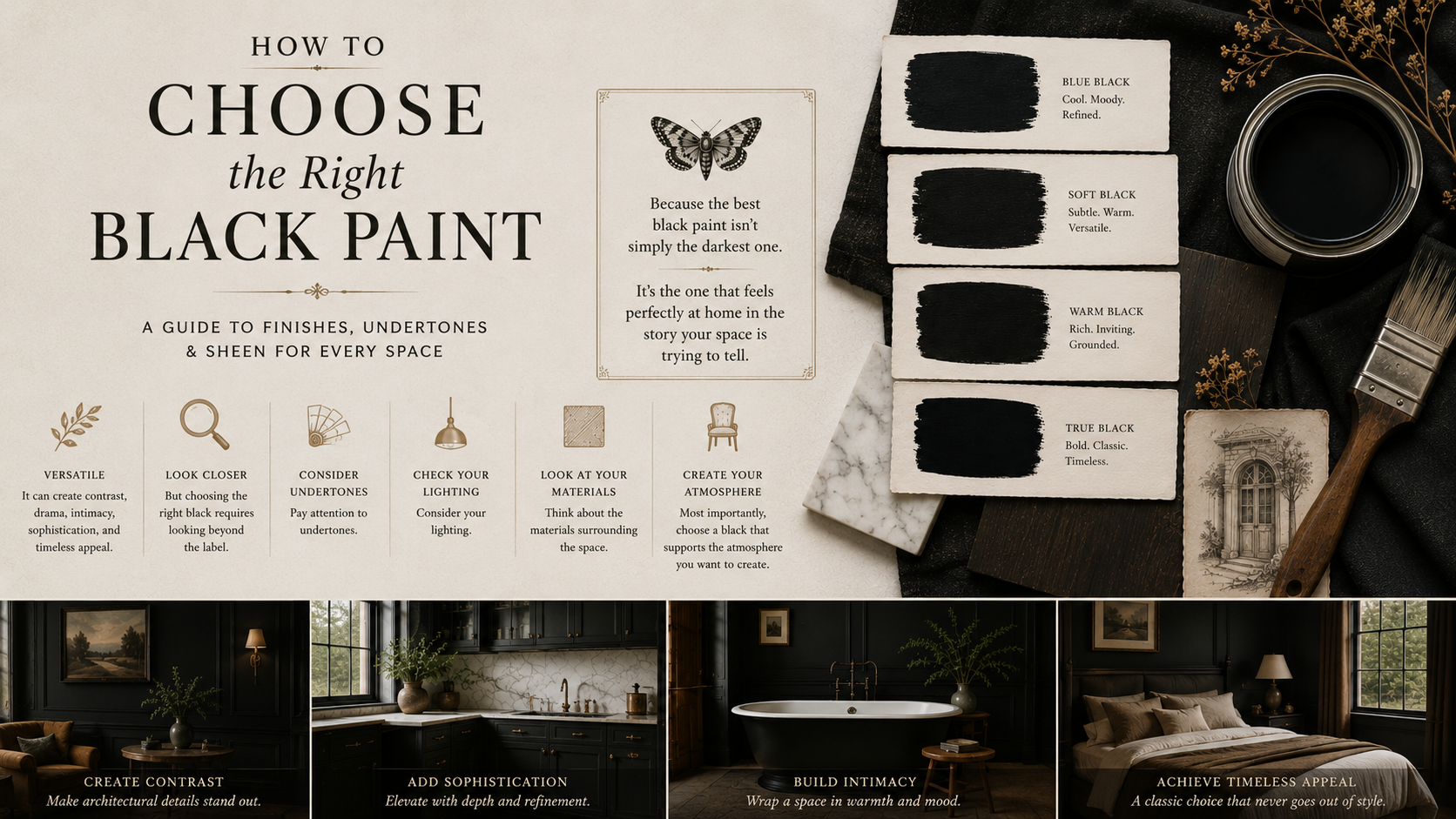
How To Choose (The Right) Black Paint
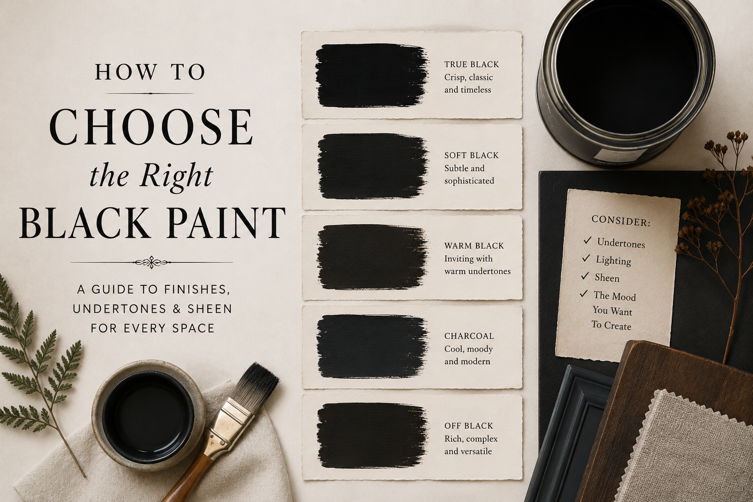
Black paint may seem simple. After all, black is black…right? In reality, black is one of the most nuanced and misunderstood colors in interior design. The difference between one black paint and another can dramatically affect the mood, character, and overall feel of a room or furniture piece. Some blacks feel crisp and architectural. Others feel soft and collected. Some reveal hints of blue, green, brown, or charcoal, while others remain deep and neutral.
Understanding those differences is the key to choosing the right black for your project.

Absolute Black by Mélange Paints
Not All Black Paints Are Created Equal
When most people imagine black paint, they're picturing a true black—a color that absorbs light, creates strong contrast, and feels bold and graphic.
True blacks are dramatic. They create sharp definition and can make trim, cabinetry, furniture, and architectural details stand out with striking clarity.
But many of the blacks designers love most aren't true blacks at all.
They're softened blacks.
Soft blacks contain subtle undertones that give them depth and complexity. These undertones might lean blue, green, brown, or charcoal, creating a color that feels richer and often easier to live with than a pure black.
Rather than appearing flat, they shift slightly throughout the day as lighting conditions change.
That complexity is often what makes a black paint feel sophisticated rather than stark.

Start With the Mood You Want to Create
Before choosing a black paint, consider what you want the finished space or furniture piece to feel like.
Do you want something dramatic and modern? A true black may be the right choice.
Do you want something moody and atmospheric? A softened black often works better.
Do you want a black that complements natural wood tones and vintage furnishings? Look for blacks with subtle warm or earthy undertones.
Do you want something crisp and contemporary? A cooler black may be a better fit.
The best black isn't necessarily the darkest one. It's the one that supports the feeling you're trying to create.

How Lighting
Changes Black Paint
Lighting plays a bigger role with black paint than many people realize.
Natural daylight reveals undertones that may not be obvious under artificial lighting. A black that appears neutral in a paint chip can suddenly reveal hints of blue, green, or brown once it's applied to a larger surface.
Rooms with abundant natural light can often support darker and more saturated blacks without feeling heavy.
In smaller rooms or darker spaces, softer blacks frequently create a more inviting atmosphere because they absorb light more gently.
This is one reason designers often recommend sampling black paints before committing to a full project.
The undertones become much easier to recognize once the color is applied to a larger surface.
Consider the Materials Around It
Black paint never exists in isolation.
The surrounding materials dramatically influence how it appears.
Warm woods such as oak, walnut, and reclaimed pine often pair beautifully with softened blacks because both share a natural warmth.
Brass hardware tends to look particularly rich against blacks with earthy or charcoal undertones.
Crisp white walls, polished metals, and modern interiors often benefit from a cleaner, truer black that creates intentional contrast.
The goal isn't simply choosing a black paint.
It's choosing a black that works harmoniously with everything around it.
Understanding the Different Types of Black
One of the easiest ways to narrow your options is to think about black paints in categories.


-
True blacks create maximum contrast and visual impact. They feel clean, bold, and architectural. At Mélange, Absolute represents this category; a classic true black that creates crisp definition and timeless drama. True blacks work especially well in contemporary interiors, modern cabinetry, and projects where strong contrast is desired.
-
Blue-black paints contain subtle blue undertones that create depth and richness.
These colors often feel slightly softer than a true black while maintaining plenty of drama.
Nightfall belongs in this category.
Its deep blue-black character creates a sense of atmosphere and mystery while remaining incredibly versatile.
Blue-black paints pair beautifully with natural wood, brass accents, and layered neutral palettes.
-
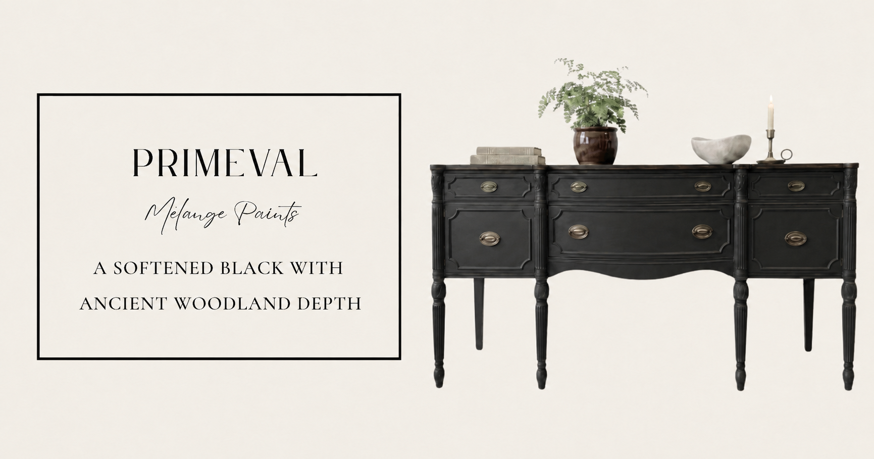
Soft blacks sit somewhere between charcoal and black.
These colors feel gentler and often blend more naturally into traditional or collected interiors.
Nocturne and Primeval both explore this territory.
Rather than demanding attention, they create mood and depth.
They're excellent choices for furniture pieces, libraries, studies, and spaces where warmth is important.
-
Some blacks incorporate brown, olive, or earthy undertones.
These colors feel grounded and organic, making them particularly attractive in naturalist, cottage, and heritage-inspired interiors.
Blackbriar exemplifies this approach.
Its complexity allows it to feel substantial without appearing harsh.
The Most Common Mistake People Make
The biggest mistake homeowners make when choosing black paint is focusing solely on darkness.
Darker isn't always better.
Many people assume the deepest black available will automatically create the most dramatic result.
In reality, undertones often matter far more than darkness.
A slightly softened black can create significantly more character than a flat, featureless black.
That's why designers frequently gravitate toward complex blacks rather than the darkest option on the paint deck.
The subtle undertones create movement, interest, and a sense of depth that feels intentional and collected.
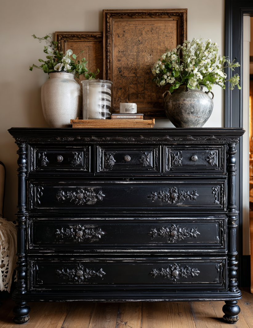
Black remains one of the most popular furniture colors for good reason.
It highlights architectural details, works with nearly every decorating style, and creates instant sophistication.
For furniture, consider how the piece will be used.
Statement pieces often benefit from deeper, more dramatic blacks.
Vintage furniture frequently looks beautiful in softened blacks that preserve warmth and character.
Cabinetry and built-ins can go either direction depending on the surrounding space.
The key is understanding that black is not a single color—it is an entire family of colors.